- What we love most about clothes for fun is their clean web 2.0 design that is functional using only ONE colour.
- They decided to forsake all image banners' linking, no shoutboxes too but has managed to be one of the top online boutiques in Malaysia. Not a small feat! Due to that, they had kept the blog design minimal with alot of whitespaces in the design that relaxes the random surfers that drop in to their blog.
- Because of the lack of colour usage in their blog, their clothes' images managed to draw your attention effectively, keeping the customers focused on their products.
- Their service is impeccable as well. Using feedback from customers in their blog, they catered and responded accordingly to keep their customers happy.
- These reasons are exactly why they have a constant stream of customers. For new online boutiques that want to break into the market, this is the blog to refer to when it comes to design and marketing.
- Enough talk.. goodies ahead..
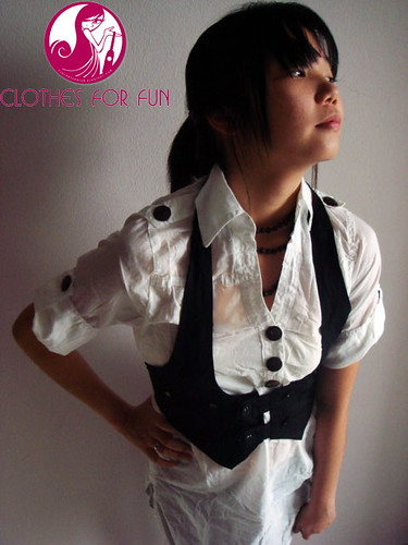
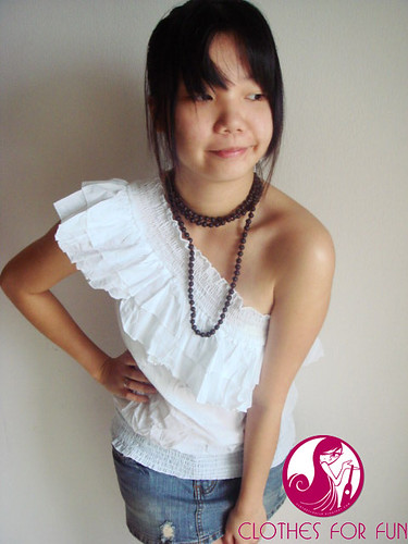
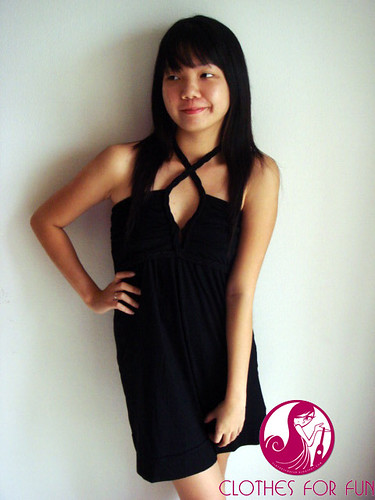
 A clever use of watermark on each of their images gives their catalog a professional look.
 Another point to take in : use flat colored background when you are taking photos of your models, it gives a photo studio look that is both professional and draws attention to your clothes! **unless your background image serves a purpose.
Like in Blushberry, you may notice that every photo is taken with this background image. A wall painting I did for Blushberry photoshoot which is inspired by Audrey Kawasaki's works.
 More tips on photography, if u can; use natural daylight to light your model.
Its great to take your photos with a window right next to you that is providing the light.
The effect is a soft lighting that makes your model look fairer and hides most of their skin flaws. I think this is taken quite late in the day.. you can tell by the temperature in the photo.. which is yellowish..the best time to take photographs indoors with a window next to you is in the morning where the shadows are not so harsh.
Afternoon lighting can be nice if you know how to play with the lighting effects.
Look closely at the bottom area of the photograph.. you can see a bit of the floor showing there.. it is best to avoid any of this distractions in the background eg (cupboards, tables, bed etc)
I believe I don't have to comment much on their choice of clothes with is top grade.
Clothes for fun online boutiques fashion


